One thing (option) the Update offers is showing Store APPs on the Taskbar. Fair enough &...
Please, note: IF this is chosen, The Switcher Bar is, still, there, so they are, in effect, in 2 locations. However, the functionality is not identical @ each. Handy as it is having them on the Taskbar, there are some actions only in the Switcher Bar. Having them on the Taskbar does allow one to SEE them (all the time) & Open them without, having to 'pop out' the Switcher Bar; added convenience.
Also, notice, added functionality regarding manipulating APPs, from the Taskbar, in terms of Open, Minimize, Close & positioning. There is a wee bar @ the Top or Side of the APP. To the Right or Bottom is - & x. @ the other end, an icon for the APP which, gives maneuvering or positioning choices as per the Switcher Bar. This is part of the 'nicer for mousers' effort.
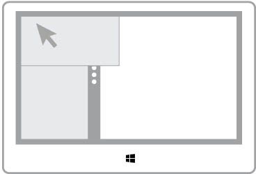
Speaking of the Switcher Bar... this may have existed, already, and I just hadn't noticed it. Found it whilst investigating things après the Update. Anyway, if you Left Clk & hold, you can 'pull' an APP off or from the Switcher Bar, it kind of 'floats', is large enough to view nicely on top of the desktop... won't, actually, 'pop' the APP until & unless you Clk on it.
Another piece of trivia going back to APPs on the Taskbar... Anything pinned to the Taskbar can be moved about, positioned wherever laterally as one wants. The same can be done w/ the APP 'icons' although, they & the 'others' don't mix together.
Hope I've said this such that it makes sense or is written so it is understandable.
Cheers,
Drew
 .1
.1
Please, note: IF this is chosen, The Switcher Bar is, still, there, so they are, in effect, in 2 locations. However, the functionality is not identical @ each. Handy as it is having them on the Taskbar, there are some actions only in the Switcher Bar. Having them on the Taskbar does allow one to SEE them (all the time) & Open them without, having to 'pop out' the Switcher Bar; added convenience.
Also, notice, added functionality regarding manipulating APPs, from the Taskbar, in terms of Open, Minimize, Close & positioning. There is a wee bar @ the Top or Side of the APP. To the Right or Bottom is - & x. @ the other end, an icon for the APP which, gives maneuvering or positioning choices as per the Switcher Bar. This is part of the 'nicer for mousers' effort.
Speaking of the Switcher Bar... this may have existed, already, and I just hadn't noticed it. Found it whilst investigating things après the Update. Anyway, if you Left Clk & hold, you can 'pull' an APP off or from the Switcher Bar, it kind of 'floats', is large enough to view nicely on top of the desktop... won't, actually, 'pop' the APP until & unless you Clk on it.
Another piece of trivia going back to APPs on the Taskbar... Anything pinned to the Taskbar can be moved about, positioned wherever laterally as one wants. The same can be done w/ the APP 'icons' although, they & the 'others' don't mix together.
Hope I've said this such that it makes sense or is written so it is understandable.
Cheers,
Drew
Last edited by a moderator:
