

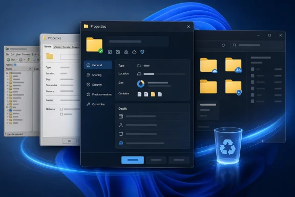
Microsoft appears to be preparing one of Windows 11’s most overdue visual renovations: a modern WinUI-based replacement for File Explorer’s decades-old file Properties dialog. The first hidden implementation has surfaced in a Windows 11 preview build, currently limited to the Properties window for an item inside the Recycle Bin, but its presence suggests a broader modernization effort is underway. If Microsoft extends the design across ordinary files, folders, drives, shortcuts, security settings, and specialized file types, it could eliminate one of the most visible remnants of legacy Windows from an application that users interact with every day.
File Explorer illustrates both the strength and the architectural burden of Windows. It has accumulated features, extension points, compatibility layers, and management interfaces over several decades, allowing new versions of Windows to support workflows and applications created long before Windows 11 existed.
That continuity is enormously valuable, particularly in business environments. It also means the modern File Explorer frequently acts as a polished front end to dialogs and components whose designs originated in Windows 95, Windows XP, Windows Vista, or later iterations of the classic Win32 desktop.
Yet Microsoft did not rebuild the entire application. Instead, it placed newer XAML and WinUI surfaces alongside established Win32 components, creating a hybrid architecture that could evolve without breaking decades of compatibility.
This approach reduced deployment risk, but it produced an uneven experience. Users can move from a modern File Explorer window into a legacy dialog within a single click, sometimes encountering different fonts, spacing rules, button styles, keyboard behavior, dark-mode support, and accessibility characteristics.
Folder and drive Properties windows expose still more functions, including sharing, security, storage usage, customization, indexing behavior, and hardware-related information. Because the dialog sits at the intersection of the shell, file system, security model, and third-party extensions, modernizing it is more complicated than applying rounded corners and a new title bar.
The interface is hidden, unfinished, and not officially documented as a user-facing feature. That distinction is important: its inclusion does not guarantee that Microsoft will ship the current design, preserve its feature set, or release it on any particular schedule.
Microsoft can use this relatively contained scenario to validate the fundamentals of a new dialog framework. Those fundamentals include window creation, metadata retrieval, theme handling, localization, keyboard navigation, scaling, and integration with the shell.
A contained test also limits the compatibility blast radius. If a modern dialog fails to represent every advanced capability of a normal file or folder, Microsoft can continue routing most users to the classic implementation while developing the replacement behind a feature flag.
The larger change is structural, not cosmetic. Classic property sheets generally arrange information across compact tabs, while a modern design may group metadata into clearer sections with responsive controls and improved information hierarchy.
That could make basic facts easier to scan, especially on high-resolution displays. However, it also raises questions about information density, because experienced users often value the classic dialog precisely because it places many fields and controls inside a relatively small window.
File Explorer makes this inconsistency unusually visible because it serves as a gateway to so many shell functions. A user can begin in a modern tabbed window, open a partially modern context menu, select an old control panel item, and finish in a classic property sheet without leaving the same workflow.
Its visible surfaces therefore come from different eras and technology stacks. Some are modern WinUI experiences, some use earlier XAML implementations, and others rely on classic Win32 controls or specialized system frameworks.
This architecture explains why Microsoft cannot simply “redesign File Explorer” as one project. Each component has dependencies, automation interfaces, extension models, security assumptions, and accessibility behaviors that must remain functional throughout the transition.
A modern WinUI Properties interface should inherit system theme settings more reliably. It could also respond better to contrast modes, text scaling, display-density changes, and future personalization options.
Dark mode alone would not justify a major rewrite, but it represents a visible symptom of a deeper problem. When one interface cannot participate properly in system-wide behavior, it often indicates that the underlying component is difficult to evolve.
Microsoft has increasingly positioned WinUI 3 as a strategic framework for native Windows experiences. In 2026, the company publicly committed to reducing interaction latency by improving the shared UI infrastructure and moving more core Windows surfaces to WinUI 3.
The potential benefits include:
WinUI 3 applications still depend on a substantial framework and can suffer from slow startup, memory overhead, or UI delays if implemented poorly. File Explorer is especially sensitive because users expect it to respond immediately, often while the system is already under disk, CPU, memory, or network pressure.
The success of the new Properties dialog will therefore depend less on the framework’s label than on execution. A beautiful dialog that takes noticeably longer to open would intensify criticism rather than resolve it.
A text document may expose a straightforward General tab, while an executable can include Details, Compatibility, Security, and Digital Signatures. Media files may show editable metadata, shortcuts gain Shortcut controls, and network resources can introduce sharing-related interfaces.
Microsoft has several broad options:
These functions must accurately distinguish between effective permissions, explicit entries, inherited entries, unavailable privileges, and operations requiring elevation. A visual simplification that obscures those distinctions could lead users or administrators to make damaging changes.
Microsoft must also protect elevation boundaries. If the new dialog launches administrative actions or writes access-control changes, it must preserve User Account Control behavior, secure desktop transitions where applicable, and clear error reporting.
Some metadata may require hydration, network communication, or calls into an extension. The modern dialog must avoid freezing while those operations complete and clearly distinguish between information that is loading, unavailable, or not applicable.
Asynchronous loading could be a major improvement over the old model. It could also introduce fields that appear late, shift the layout, or report incomplete values if Microsoft does not design the loading states carefully.
The company has also been optimizing WinUI itself. Reported internal measurements associated with File Explorer launch work showed reductions in allocations, transient allocations, function calls, and time spent in WinUI code, indicating that Microsoft understands framework overhead must be addressed before expanding WinUI’s role.
That workflow leaves little tolerance for a splash screen, visible framework initialization, delayed controls, or an empty shell while content loads. The classic dialog may be visually dated, but it often appears quickly because its controls and hosting mechanisms are mature and deeply integrated.
Microsoft should measure more than laboratory startup time. Testing needs to cover cold starts, warm starts, battery-saving modes, low-memory situations, remote storage, cloud placeholders, large multi-file selections, accessibility tools, and machines with numerous shell extensions.
That is the strategic argument for undertaking foundational work instead of optimizing isolated screens. A shared improvement can compound across every WinUI surface a user opens during the day.
However, shared dependencies also create shared failure modes. A framework regression could affect several core experiences simultaneously, making disciplined testing and rollback mechanisms essential.
A modern design gives Microsoft an opportunity to explain these concepts without stripping away advanced capabilities. Better grouping, contextual descriptions, progressive disclosure, and clearer status indicators could make the dialog useful to a broader audience.
Microsoft must resist the temptation to move every advanced function into Settings. Properties is valuable because it provides object-specific controls in context, directly beside the file or folder being managed.
A modern interface could provide concise explanations and better visual indicators. It might separately identify logical file size, locally consumed space, cloud-only content, and storage occupied after compression.
Such clarity would be particularly helpful for OneDrive users. A cloud placeholder may represent a large file in the namespace while consuming little local storage, and the conventional Properties presentation does not always communicate that relationship intuitively.
It could also calculate those values progressively rather than making the interface appear frozen. Cancelable calculations would help when users accidentally request properties for a huge directory tree or remote folder.
Dark-mode support could be especially noticeable. Users who keep Windows in a dark theme would no longer be pushed into a bright legacy window simply to check a file’s size or change its default application.
A clearer interface could guide those tasks without turning Properties into a wizard. Helpful descriptions and well-labeled actions could reduce reliance on online instructions that refer to ambiguous tabs and buttons.
The redesign may also improve touch use on tablets and convertible PCs. Classic property sheets were designed around precise mouse input and compact desktop layouts, while WinUI controls generally provide larger targets and more adaptable spacing.
The Properties dialog should ideally offer a balanced layout that remains compact on a keyboard-and-mouse PC while scaling appropriately for touch and accessibility settings. Modernization should not mean turning a small utility window into a full-screen settings page.
Security, sharing, ownership, offline files, encryption, digital signatures, and network-path behavior all have enterprise implications. A missing control or misleading status could disrupt established support procedures.
The impact will be manageable if the rollout is gradual and the feature set remains familiar. It becomes more significant if classic pages and modern pages coexist unpredictably across devices or file types.
Microsoft should provide clear release notes and management guidance before broad deployment. Administrators also need to know whether the interface can be controlled through policy, whether the legacy dialog remains accessible, and how long any compatibility fallback will be supported.
Animations, transparency, and complex visual effects should degrade gracefully. Functionality must also remain available when graphics acceleration is limited or when administrators disable nonessential visual effects.
Administrators and support staff often navigate these windows entirely by keyboard. Familiar shortcuts, predictable tab order, and clear accelerator behavior should not be sacrificed for visual novelty.
Microsoft does not need to imitate those products directly. It does, however, need Windows to feel intentional, particularly as the company promotes premium hardware, native app development, and a renewed focus on performance and quality.
Using WinUI for core shell experiences gives Microsoft a demanding real-world test bed. File Explorer exposes the framework to millions of hardware configurations, unusual storage providers, assistive technologies, localization scenarios, and extension combinations.
If Microsoft can deliver a fast and reliable Properties dialog under those conditions, it strengthens the case that WinUI is suitable for serious desktop software. If the result is slow, incomplete, or unstable, developers may become more skeptical of the platform.
Modernizing a mundane but heavily used dialog fits that shift. It does not generate the same marketing spectacle as an AI feature, but it addresses the daily friction that shapes users’ perception of operating-system quality.
That distinction matters. Windows enthusiasts have repeatedly asked Microsoft to repair and refine the existing desktop before layering additional services on top of it.
That would be a substantial engineering project, but the payoff could include fewer crashes and easier diagnosis when an add-on misbehaves. Microsoft could also enforce clearer capability declarations and prevent extensions from delaying the entire dialog.
The challenge will be maintaining enough flexibility for specialized workflows. A rigid card-based model may look consistent but fail to accommodate complex controls used by professional software.
The discovered Recycle Bin dialog should therefore be treated as evidence of active development, not confirmation of a complete File Explorer overhaul. Even if Microsoft announces the feature, controlled feature rollout technology means availability may differ among devices running the same build.
A strong redesign should preserve those virtues rather than dismiss them. Microsoft’s goal should be to modernize the implementation and presentation while retaining the speed and precision that experienced Windows users expect.
Windows Insiders should also watch official release notes carefully. Microsoft has not announced the modernized Properties dialog as of July 21, 2026, and hidden components may require unsupported tools or feature identifiers to activate.
For that reason, seeing the new dialog in a particular build does not establish its final release vehicle. The more meaningful indicators will be official documentation, broader scenario coverage, compatibility behavior, and whether the feature is enabled by default.
They should also test keyboard navigation, screen readers, high contrast, large text, multiple monitors, mixed display scaling, and dark-mode transitions. Problems discovered at this stage are far easier to address than defects found after the old implementation has been retired.
Microsoft’s first hidden WinUI Properties dialog is a small window into a much larger Windows 11 challenge: how to replace aging interfaces without sacrificing the compatibility, density, speed, and administrative depth that made them durable. The emerging Recycle Bin implementation does not yet prove that the entire File Explorer property system is being replaced, but it provides the clearest indication so far that Microsoft is tackling another deeply embedded legacy surface. If the company combines modern design with instant response, complete functionality, robust extension compatibility, and careful enterprise support, this could become one of the most meaningful refinements in the broader effort to make Windows 11 feel coherent. If it delivers only a prettier shell around missing features and slower code, users will rightly prefer the old dialog; the standard for success is not whether Properties looks new, but whether it works better.
 Background
File Explorer illustrates both the strength and the architectural burden of Windows. It has accumulated features, extension points, compatibility layers, and management interfaces over several decades, allowing new versions of Windows to support workflows and applications created long before Windows 11 existed.That continuity is enormously valuable, particularly in business environments. It also means the modern File Explorer frequently acts as a polished front end to dialogs and components whose designs originated in Windows 95, Windows XP, Windows Vista, or later iterations of the classic Win32 desktop.
A modernization that never happened all at once
Microsoft introduced a redesigned File Explorer command bar with Windows 11 in October 2021, replacing the Windows 10 ribbon with a simpler row of common actions. Subsequent updates added tabs, a refreshed navigation pane, a Gallery view, a modern Home page, improved sharing controls, and a redesigned details pane.Yet Microsoft did not rebuild the entire application. Instead, it placed newer XAML and WinUI surfaces alongside established Win32 components, creating a hybrid architecture that could evolve without breaking decades of compatibility.
This approach reduced deployment risk, but it produced an uneven experience. Users can move from a modern File Explorer window into a legacy dialog within a single click, sometimes encountering different fonts, spacing rules, button styles, keyboard behavior, dark-mode support, and accessibility characteristics.
Why the Properties dialog matters
The Properties dialog is not an obscure administrative utility. Users open it to check a file’s size, location, creation date, modification date, attributes, ownership, permissions, digital signatures, version metadata, and associated application.Folder and drive Properties windows expose still more functions, including sharing, security, storage usage, customization, indexing behavior, and hardware-related information. Because the dialog sits at the intersection of the shell, file system, security model, and third-party extensions, modernizing it is more complicated than applying rounded corners and a new title bar.
What Has Been Discovered
The early implementation was reportedly spotted by Windows researcher Phantomofearth in a recent Windows 11 preview build. It appears when opening the Properties window for a file located in the Recycle Bin, rather than when inspecting an ordinary file elsewhere in File Explorer.The interface is hidden, unfinished, and not officially documented as a user-facing feature. That distinction is important: its inclusion does not guarantee that Microsoft will ship the current design, preserve its feature set, or release it on any particular schedule.
A narrow test surface
Starting with Recycle Bin properties makes practical engineering sense. The Recycle Bin uses a specialized shell namespace in which deleted items retain information about their original locations and deletion dates, so its Properties experience already differs from that of a conventional file.Microsoft can use this relatively contained scenario to validate the fundamentals of a new dialog framework. Those fundamentals include window creation, metadata retrieval, theme handling, localization, keyboard navigation, scaling, and integration with the shell.
A contained test also limits the compatibility blast radius. If a modern dialog fails to represent every advanced capability of a normal file or folder, Microsoft can continue routing most users to the classic implementation while developing the replacement behind a feature flag.
The first look at the design
The discovered window adopts visual conventions associated with Windows 11 and WinUI, including cleaner typography, more generous spacing, updated controls, and a layout that feels related to Settings and other modern system applications. It appears better suited to light and dark themes than the conventional tabbed property sheet.The larger change is structural, not cosmetic. Classic property sheets generally arrange information across compact tabs, while a modern design may group metadata into clearer sections with responsive controls and improved information hierarchy.
That could make basic facts easier to scan, especially on high-resolution displays. However, it also raises questions about information density, because experienced users often value the classic dialog precisely because it places many fields and controls inside a relatively small window.
Why File Explorer Still Feels Fragmented
Windows 11 has a recognizable design language, but it does not apply that language consistently. Acrylic and Mica materials, rounded geometry, modern icons, spacious layouts, and updated typography coexist with interfaces that still resemble earlier generations of Windows.File Explorer makes this inconsistency unusually visible because it serves as a gateway to so many shell functions. A user can begin in a modern tabbed window, open a partially modern context menu, select an old control panel item, and finish in a classic property sheet without leaving the same workflow.
Multiple generations in one application
The current File Explorer is not a single, cleanly separated application in the way many mobile apps are. It participates in the Windows shell and invokes shared operating-system components, COM interfaces, namespace extensions, file handlers, preview handlers, property handlers, and administrative tools.Its visible surfaces therefore come from different eras and technology stacks. Some are modern WinUI experiences, some use earlier XAML implementations, and others rely on classic Win32 controls or specialized system frameworks.
This architecture explains why Microsoft cannot simply “redesign File Explorer” as one project. Each component has dependencies, automation interfaces, extension models, security assumptions, and accessibility behaviors that must remain functional throughout the transition.
Dark mode exposes the seams
Theme inconsistency is one of the clearest consequences. File Explorer itself can use a dark theme, but opening certain dialogs may produce a bright white window that interrupts the experience and can be uncomfortable in a dark workspace.A modern WinUI Properties interface should inherit system theme settings more reliably. It could also respond better to contrast modes, text scaling, display-density changes, and future personalization options.
Dark mode alone would not justify a major rewrite, but it represents a visible symptom of a deeper problem. When one interface cannot participate properly in system-wide behavior, it often indicates that the underlying component is difficult to evolve.
WinUI 3 and Microsoft’s Native Interface Strategy
WinUI 3 is Microsoft’s modern native user-interface framework for Windows desktop applications. Delivered through the Windows App SDK, it gives developers access to contemporary controls, styling, windowing capabilities, and Windows design conventions without limiting applications to the older Universal Windows Platform model.Microsoft has increasingly positioned WinUI 3 as a strategic framework for native Windows experiences. In 2026, the company publicly committed to reducing interaction latency by improving the shared UI infrastructure and moving more core Windows surfaces to WinUI 3.
Why WinUI is attractive
A common framework can help Microsoft standardize controls and behavior across the operating system. Instead of independently implementing theme support, focus indicators, animations, accessibility patterns, and input behavior for every dialog, teams can rely more heavily on shared components.The potential benefits include:
- Modern controls can provide more consistent keyboard, mouse, touch, pen, and accessibility behavior.
- Central framework improvements can benefit multiple Windows components without redesigning each one independently.
- Shared styling can reduce visual differences between File Explorer, Settings, Start, and inbox applications.
- WinUI can support high-DPI scaling and dynamic theme changes more naturally than many older interfaces.
- A modern code path can make future enhancements easier to introduce and maintain.
Native does not mean simple
Descriptions of WinUI as “native” can create the impression that Microsoft is replacing web technology with a straightforward, lightweight desktop toolkit. The actual architecture is more nuanced.WinUI 3 applications still depend on a substantial framework and can suffer from slow startup, memory overhead, or UI delays if implemented poorly. File Explorer is especially sensitive because users expect it to respond immediately, often while the system is already under disk, CPU, memory, or network pressure.
The success of the new Properties dialog will therefore depend less on the framework’s label than on execution. A beautiful dialog that takes noticeably longer to open would intensify criticism rather than resolve it.
The Technical Challenge of Replacing Property Sheets
The familiar Properties window is more than a static list of metadata. It is an extensible property sheet that can display different tabs depending on the selected object, installed software, file-system capabilities, security context, and device configuration.A text document may expose a straightforward General tab, while an executable can include Details, Compatibility, Security, and Digital Signatures. Media files may show editable metadata, shortcuts gain Shortcut controls, and network resources can introduce sharing-related interfaces.
Shell extensions complicate the rewrite
Third-party applications can add property-sheet pages through established Windows shell-extension mechanisms. Security software, cloud-storage clients, archive utilities, source-control tools, media applications, hardware vendors, and enterprise management products may all depend on those extension points.Microsoft has several broad options:
- It can host legacy extension pages inside the new Properties window.
- It can open classic property sheets when an unsupported extension is detected.
- It can define a modern extension model and encourage developers to migrate.
- It can combine these approaches during a long compatibility transition.
Security pages require special care
The Security tab is one of the most consequential parts of file Properties. It exposes access-control entries, inherited permissions, ownership, auditing options, and advanced controls backed by the Windows security model.These functions must accurately distinguish between effective permissions, explicit entries, inherited entries, unavailable privileges, and operations requiring elevation. A visual simplification that obscures those distinctions could lead users or administrators to make damaging changes.
Microsoft must also protect elevation boundaries. If the new dialog launches administrative actions or writes access-control changes, it must preserve User Account Control behavior, secure desktop transitions where applicable, and clear error reporting.
Metadata is not always local
File Properties can involve more than reading a few bytes from an NTFS record. The selected object might reside on a slow network share, a disconnected mapped drive, removable storage, a cloud placeholder, a Linux file system exposed through WSL, or a third-party virtual namespace.Some metadata may require hydration, network communication, or calls into an extension. The modern dialog must avoid freezing while those operations complete and clearly distinguish between information that is loading, unavailable, or not applicable.
Asynchronous loading could be a major improvement over the old model. It could also introduce fields that appear late, shift the layout, or report incomplete values if Microsoft does not design the loading states carefully.
Performance Will Decide Whether Users Accept It
Windows users have repeatedly criticized File Explorer for sluggish launches, delayed context menus, navigation pauses, and inconsistent responsiveness. Microsoft acknowledged these concerns in March 2026 when it outlined plans for faster launches, reduced flicker, smoother navigation, lower search latency, and more reliable file operations.The company has also been optimizing WinUI itself. Reported internal measurements associated with File Explorer launch work showed reductions in allocations, transient allocations, function calls, and time spent in WinUI code, indicating that Microsoft understands framework overhead must be addressed before expanding WinUI’s role.
The Properties dialog must feel instant
Opening Properties is usually a short, transactional action. Users right-click an item, inspect one value, change one setting, and close the window.That workflow leaves little tolerance for a splash screen, visible framework initialization, delayed controls, or an empty shell while content loads. The classic dialog may be visually dated, but it often appears quickly because its controls and hosting mechanisms are mature and deeply integrated.
Microsoft should measure more than laboratory startup time. Testing needs to cover cold starts, warm starts, battery-saving modes, low-memory situations, remote storage, cloud placeholders, large multi-file selections, accessibility tools, and machines with numerous shell extensions.
Framework improvements can compound
If Microsoft reduces WinUI overhead at the platform level, the benefits could extend far beyond this dialog. Start, File Explorer, Settings, and modern inbox applications may all gain from lower allocation counts and more efficient control creation.That is the strategic argument for undertaking foundational work instead of optimizing isolated screens. A shared improvement can compound across every WinUI surface a user opens during the day.
However, shared dependencies also create shared failure modes. A framework regression could affect several core experiences simultaneously, making disciplined testing and rollback mechanisms essential.
How a Modern Properties Experience Could Improve Usability
The classic Properties dialog is dense and functional, but it often assumes that users already understand Windows terminology. Labels such as “Opens with,” “Attributes,” “Advanced attributes,” “Owner,” and “Inheritance” may be familiar to administrators while remaining opaque to less experienced users.A modern design gives Microsoft an opportunity to explain these concepts without stripping away advanced capabilities. Better grouping, contextual descriptions, progressive disclosure, and clearer status indicators could make the dialog useful to a broader audience.
Better organization without feature loss
A successful redesign could prioritize the most commonly requested information near the top:- The file name, type, icon, and associated application.
- The current location and original location where relevant.
- File size, allocated size, and cloud-storage state.
- Creation, modification, access, or deletion dates.
- Read-only, hidden, blocked, encrypted, or compressed status.
- Ownership, sharing, and permissions summaries.
Microsoft must resist the temptation to move every advanced function into Settings. Properties is valuable because it provides object-specific controls in context, directly beside the file or folder being managed.
Clearer storage information
The old dialog distinguishes between “Size” and “Size on disk,” but many users do not understand why those values differ. Compression, sparse files, allocation-unit sizes, cloud placeholders, and alternate data behavior can all affect storage reporting.A modern interface could provide concise explanations and better visual indicators. It might separately identify logical file size, locally consumed space, cloud-only content, and storage occupied after compression.
Such clarity would be particularly helpful for OneDrive users. A cloud placeholder may represent a large file in the namespace while consuming little local storage, and the conventional Properties presentation does not always communicate that relationship intuitively.
Improved multi-selection handling
Selecting several files and opening Properties currently produces an aggregated view with limited information. A modern implementation could present the total item count, combined logical size, local storage use, file-type distribution, and any mixed attribute states more clearly.It could also calculate those values progressively rather than making the interface appear frozen. Cancelable calculations would help when users accidentally request properties for a huge directory tree or remote folder.
Consumer Impact
For most home users, the immediate benefit would be visual consistency. File Explorer would feel less like a modern shell wrapped around old control panels and more like a coherent Windows 11 application.Dark-mode support could be especially noticeable. Users who keep Windows in a dark theme would no longer be pushed into a bright legacy window simply to check a file’s size or change its default application.
Easier everyday troubleshooting
Properties is often where users begin troubleshooting. They may need to determine whether a downloaded file is blocked, confirm which application opens a format, find where a shortcut points, or check whether a folder is unexpectedly read-only.A clearer interface could guide those tasks without turning Properties into a wizard. Helpful descriptions and well-labeled actions could reduce reliance on online instructions that refer to ambiguous tabs and buttons.
The redesign may also improve touch use on tablets and convertible PCs. Classic property sheets were designed around precise mouse input and compact desktop layouts, while WinUI controls generally provide larger targets and more adaptable spacing.
The danger of excessive spacing
Modern Windows interfaces sometimes trade information density for visual openness. That works well on a touch device but can frustrate desktop users who want to compare many fields without scrolling.The Properties dialog should ideally offer a balanced layout that remains compact on a keyboard-and-mouse PC while scaling appropriately for touch and accessibility settings. Modernization should not mean turning a small utility window into a full-screen settings page.
Enterprise and Administrator Impact
Enterprises care less about rounded corners than about compatibility, policy control, automation, reliability, and support costs. Any replacement for file Properties must preserve the administrative capabilities that organizations use to diagnose access issues and manage data.Security, sharing, ownership, offline files, encryption, digital signatures, and network-path behavior all have enterprise implications. A missing control or misleading status could disrupt established support procedures.
Documentation and training changes
Organizations maintain help-desk scripts, internal documentation, screenshots, and training material based on the current tabbed interface. A redesigned dialog will require those resources to be updated, particularly if Microsoft reorganizes controls rather than merely restyling them.The impact will be manageable if the rollout is gradual and the feature set remains familiar. It becomes more significant if classic pages and modern pages coexist unpredictably across devices or file types.
Microsoft should provide clear release notes and management guidance before broad deployment. Administrators also need to know whether the interface can be controlled through policy, whether the legacy dialog remains accessible, and how long any compatibility fallback will be supported.
Remote and virtual environments
Properties dialogs are frequently used in Remote Desktop, Azure Virtual Desktop, Windows 365, and other managed environments. The new interface must remain responsive over constrained connections and render correctly under remote display optimization.Animations, transparency, and complex visual effects should degrade gracefully. Functionality must also remain available when graphics acceleration is limited or when administrators disable nonessential visual effects.
Accessibility is an enterprise requirement
Modern controls can improve accessibility, but only if the final implementation receives rigorous testing. Screen-reader labels, logical focus order, high-contrast rendering, keyboard-only operation, text scaling, and automation support must match or exceed the classic dialog.Administrators and support staff often navigate these windows entirely by keyboard. Familiar shortcuts, predictable tab order, and clear accelerator behavior should not be sacrificed for visual novelty.
Competitive and Strategic Implications
File management remains a defining part of the desktop operating-system experience. Apple’s macOS, mainstream Linux desktops, and third-party Windows file managers each take different approaches to metadata, permissions, previews, and contextual actions.Microsoft does not need to imitate those products directly. It does, however, need Windows to feel intentional, particularly as the company promotes premium hardware, native app development, and a renewed focus on performance and quality.
Windows must demonstrate its own development platform
Microsoft encourages developers to build native Windows applications with WinUI 3 and the Windows App SDK. That message is less persuasive when major parts of Windows itself continue to rely on visibly older interfaces or inconsistent technology choices.Using WinUI for core shell experiences gives Microsoft a demanding real-world test bed. File Explorer exposes the framework to millions of hardware configurations, unusual storage providers, assistive technologies, localization scenarios, and extension combinations.
If Microsoft can deliver a fast and reliable Properties dialog under those conditions, it strengthens the case that WinUI is suitable for serious desktop software. If the result is slow, incomplete, or unstable, developers may become more skeptical of the platform.
A signal of priorities after the AI-heavy era
Windows 11’s recent development has often been associated with Copilot and other AI additions. In 2026, Microsoft has placed greater public emphasis on fundamentals, craft, reliability, customization, and reducing cognitive load.Modernizing a mundane but heavily used dialog fits that shift. It does not generate the same marketing spectacle as an AI feature, but it addresses the daily friction that shapes users’ perception of operating-system quality.
That distinction matters. Windows enthusiasts have repeatedly asked Microsoft to repair and refine the existing desktop before layering additional services on top of it.
Strengths and Opportunities
The hidden Properties dialog is only an early clue, but the broader direction presents several meaningful opportunities.A chance to unify the Windows shell
- Microsoft can finally give one of File Explorer’s most prominent legacy interfaces full dark-mode and Windows 11 theme support.
- A shared WinUI foundation can improve consistency across typography, controls, focus indicators, scaling, and accessibility.
- Asynchronous metadata loading could keep the window responsive when files reside on cloud, network, or removable storage.
- A clearer hierarchy could expose common information quickly while retaining advanced controls through progressive disclosure.
- Modern extension APIs could eventually provide safer and more reliable alternatives to legacy in-process shell extensions.
- Framework-level performance work may benefit Start, Explorer, Settings, and third-party WinUI applications simultaneously.
- The redesign gives Microsoft an opportunity to explain permissions, storage use, file blocking, and cloud states more clearly.
An opportunity to redesign extension safety
Legacy shell extensions can contribute to File Explorer instability because third-party code may load into shell-related processes. A modern Properties architecture could create stronger isolation boundaries or encourage out-of-process extensions.That would be a substantial engineering project, but the payoff could include fewer crashes and easier diagnosis when an add-on misbehaves. Microsoft could also enforce clearer capability declarations and prevent extensions from delaying the entire dialog.
Better consistency for developers
If Microsoft publishes reusable property controls or a modern extension contract, application developers could integrate with File Explorer more predictably. Cloud providers, backup tools, security products, and creative applications would gain a supported path for presenting file-specific information.The challenge will be maintaining enough flexibility for specialized workflows. A rigid card-based model may look consistent but fail to accommodate complex controls used by professional software.
Risks and Concerns
A modern Properties dialog can easily become an example of appearance taking priority over utility. Microsoft must avoid repeating redesigns in which advanced commands disappear, information density falls, or basic actions require additional clicks.Compatibility and performance are the central risks
- Third-party property-sheet extensions may not fit cleanly inside a WinUI host.
- The dialog could launch more slowly if WinUI initialization and metadata retrieval are not carefully optimized.
- Advanced security and sharing controls may be simplified in ways that frustrate administrators.
- Different dialogs could appear for different files, creating a new kind of inconsistency during the migration.
- Large touch-friendly spacing could force desktop users to scroll through information that previously fit on one screen.
- Theme consistency may remain incomplete if legacy extension pages are embedded within the modern window.
- An unfinished replacement could ship gradually and remain fragmented for years.
Feature flags are not product commitments
Hidden Windows features often represent experiments rather than final plans. Microsoft can revise them, disable them, or remove them before public release.The discovered Recycle Bin dialog should therefore be treated as evidence of active development, not confirmation of a complete File Explorer overhaul. Even if Microsoft announces the feature, controlled feature rollout technology means availability may differ among devices running the same build.
The classic interface still has virtues
The existing Properties dialog is visually dated, but it is compact, familiar, and efficient. Its tabs provide direct access to specialized pages, and decades of documentation describe its behavior.A strong redesign should preserve those virtues rather than dismiss them. Microsoft’s goal should be to modernize the implementation and presentation while retaining the speed and precision that experienced Windows users expect.
What to Watch Next
The most important next development will be evidence that Microsoft has expanded the WinUI interface beyond the Recycle Bin scenario. Ordinary files and folders will reveal whether the project is a narrowly scoped experiment or the beginning of a replacement for the full shell property-sheet system.Windows Insiders should also watch official release notes carefully. Microsoft has not announced the modernized Properties dialog as of July 21, 2026, and hidden components may require unsupported tools or feature identifiers to activate.
Key milestones that would confirm broader plans
- A modern General page appears for ordinary local files and folders.
- The new dialog displays file-type metadata, default-app information, and editable attributes.
- Microsoft demonstrates modern Security, Sharing, Details, Compatibility, or Digital Signatures pages.
- Legacy third-party property pages work through a documented compatibility mechanism.
- The interface receives explicit mention in Windows Insider release notes.
- Microsoft publishes guidance for developers that add property handlers or property-sheet extensions.
- The feature reaches a mainstream Insider channel and no longer requires manual activation.
- Performance testing shows that the new dialog opens as quickly as, or faster than, the classic version.
Build numbers are less important than rollout state
Microsoft now distributes many Windows features independently of major annual version changes. A component may appear in one experimental build, move into another development branch, and later reach supported systems through a cumulative update or controlled configuration rollout.For that reason, seeing the new dialog in a particular build does not establish its final release vehicle. The more meaningful indicators will be official documentation, broader scenario coverage, compatibility behavior, and whether the feature is enabled by default.
Feedback should focus on function
Insiders who encounter the dialog should look beyond visual preferences. Useful testing includes opening properties for cloud files, network files, shortcuts, signed executables, encrypted files, compressed folders, removable drives, and objects with third-party extensions.They should also test keyboard navigation, screen readers, high contrast, large text, multiple monitors, mixed display scaling, and dark-mode transitions. Problems discovered at this stage are far easier to address than defects found after the old implementation has been retired.
Microsoft’s first hidden WinUI Properties dialog is a small window into a much larger Windows 11 challenge: how to replace aging interfaces without sacrificing the compatibility, density, speed, and administrative depth that made them durable. The emerging Recycle Bin implementation does not yet prove that the entire File Explorer property system is being replaced, but it provides the clearest indication so far that Microsoft is tackling another deeply embedded legacy surface. If the company combines modern design with instant response, complete functionality, robust extension compatibility, and careful enterprise support, this could become one of the most meaningful refinements in the broader effort to make Windows 11 feel coherent. If it delivers only a prettier shell around missing features and slower code, users will rightly prefer the old dialog; the standard for success is not whether Properties looks new, but whether it works better.
References
- Primary source: Windows Central
Published: 2026-07-21T22:56:10+00:00
Microsoft is finally modernizing Windows 11's decades-old File Explorer properties window with a new UI | Windows Central
The first signs of a completely modernized File Properties window using WinUI are hidden in the latest Windows 11 preview builds.www.windowscentral.com - Official source: blogs.windows.com
- Related coverage: tomshardware.com
Microsoft promises major improvements to Windows 11 performance, reliability, and updates — lower RAM usage, fewer Copilot interactions, and enhanced File Explorer incoming | Tom's Hardware
It only took four years to get the taskbar working properly.www.tomshardware.com - Related coverage: itpro.com
'We are focused on fundamentals, prioritizing quality, and serving our core users better': Satya Nadella teases big Windows improvements – and changes could come this year | IT Pro
Microsoft CEO Satya Nadella appears to have extended an olive branch to Windows users following months of backlash over the direction of the operating system.www.itpro.com - Related coverage: pcgamer.com
Microsoft might actually make Windows 11 good as the company promises to roll back AI features and improve performance | PC Gamer
Rubs eyes with an audible squeak.www.pcgamer.com
